Best UI libraries in 2026
Component kits, headless primitives, and design token tooling.
Component libraries live or die on the details you only hit in week three: focus handling, controlled state, and whether you can restyle the thing without fighting it. Watching one before release is worthwhile because the maintainers are still deciding how much they own — the styles, the behaviour, or both. These are also the easiest listings to judge from a teaser, since a component library can show you most of what it is in a single screenshot.
10 tools

Extend UI
LaunchedAn open-source React UI kit for document apps: PDF, DOCX, XLSX and CSV viewers and more.

tldraw
LaunchedAn infinite canvas SDK for React, and the whiteboard built on top of it.

Lenis
LaunchedA lightweight smooth scroll library from the studio darkroom.engineering.

Motion
LaunchedAn animation library for React, JavaScript and Vue, formerly known as Framer Motion.
GSAP
LaunchedA JavaScript animation library for timelines, scroll-driven effects and complex sequencing.

Tailwind CSS
LaunchedA utility-first CSS framework for building designs directly in your markup.
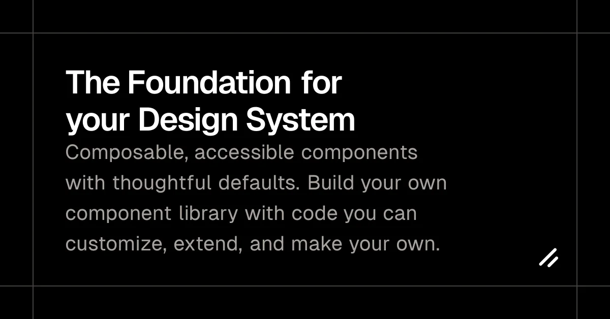

shadcn/ui
LaunchedAccessible React components you copy into your project and own, built on Radix and Tailwind CSS.
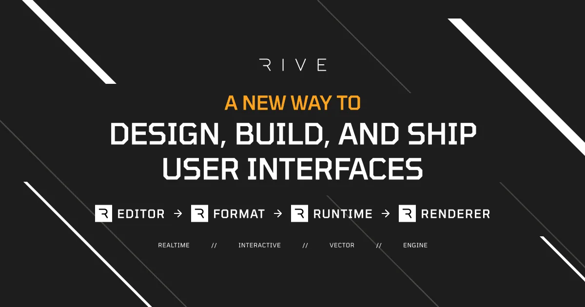

Rive
LaunchedA design tool and runtime for interactive animations that ship to web, mobile and games.
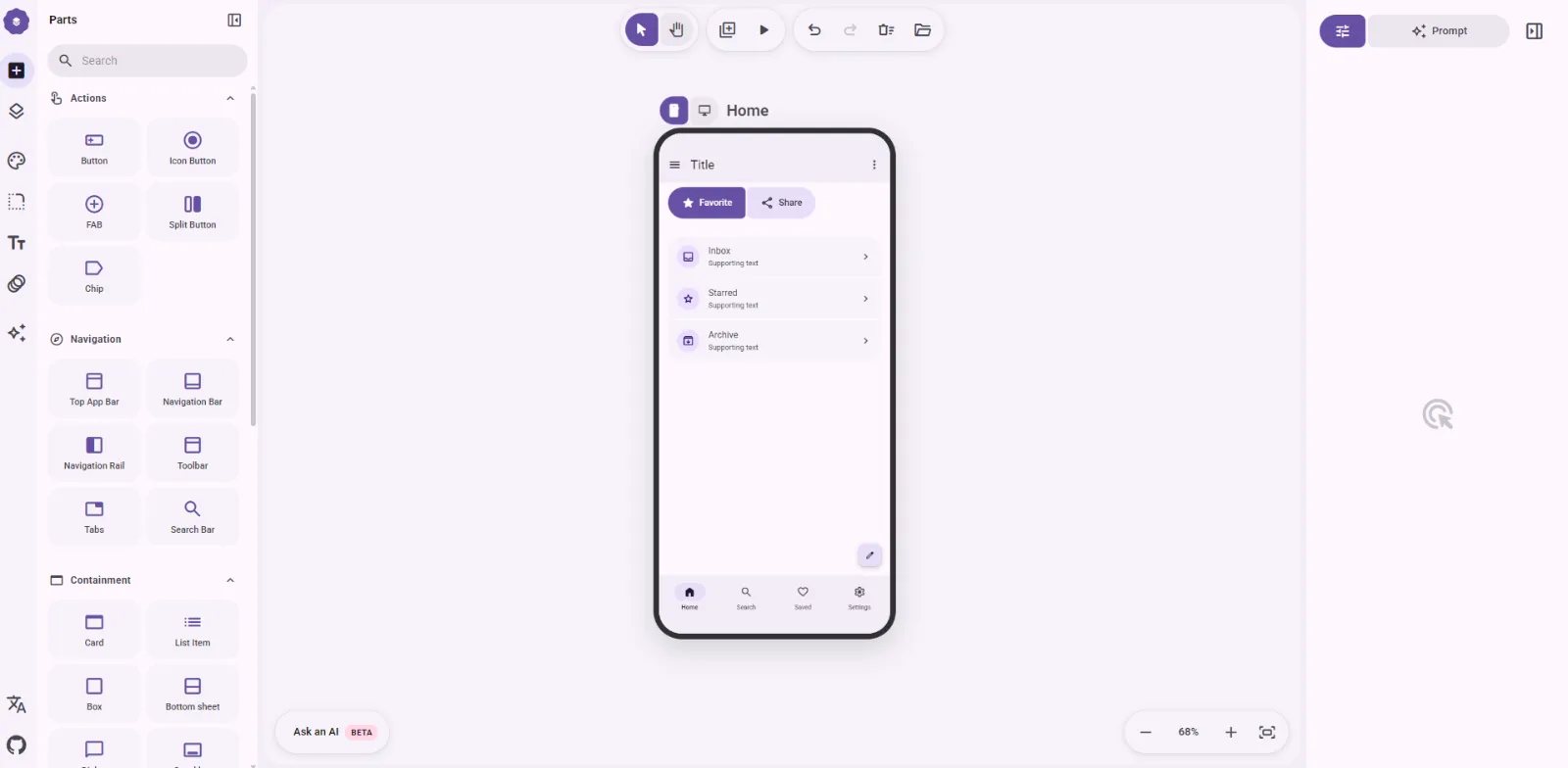

M3e Canvas
LaunchedSketch Material 3 Expressive screens in the browser and turn them into vibe-coding prompts.
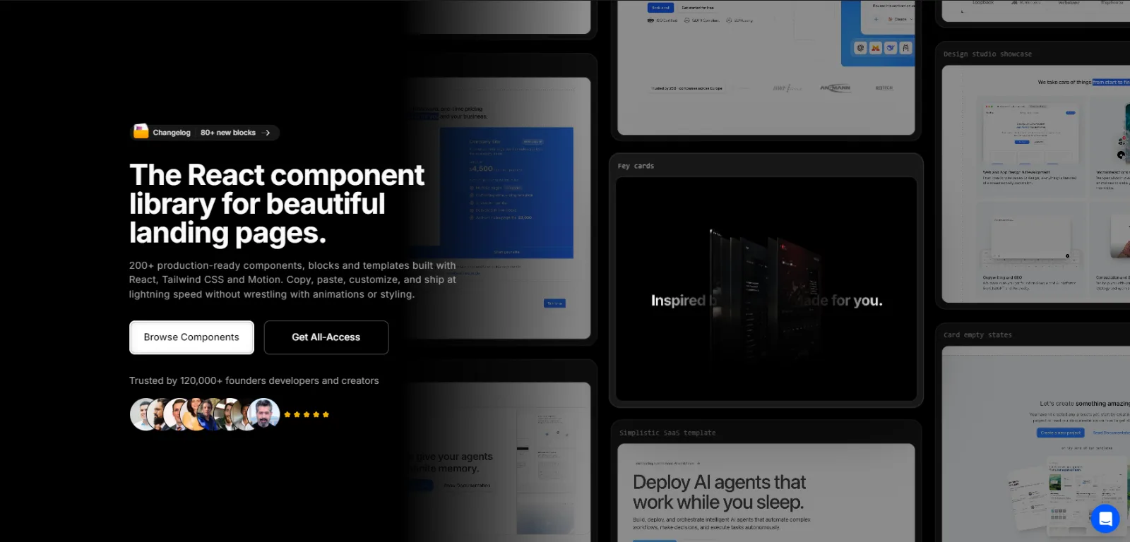

Aceternity UI
LaunchedAnimated React and Tailwind CSS components, blocks and templates for landing pages.
Evaluating
What to look for
Questions that are far easier to ask before a launch than after one.
Check keyboard and screen reader behaviour first
Accessibility is the hardest thing to retrofit and the easiest to claim. Look for a named standard, an audit, or at minimum visible focus management in the demo.
See who owns the styles
Unstyled primitives, a themeable system, and a finished look are three different products. Fitting one into a codebase built for another is where the work goes.
Look at what it does to your bundle
Tree shaking, how CSS is delivered, and whether it drags in a runtime matter more here than almost anywhere else, because these components end up on every page.
FAQ
Questions about this category
Do these work with Tailwind, CSS modules, or plain CSS?
It varies, and it is the first thing to check. Some ship finished styles, some ship unstyled primitives and expect you to bring your own system, and moving between the two is real work.
Is accessibility usually covered?
Not automatically. Some projects name a standard such as WCAG 2.2 and some never mention it. Before launch is a good time to ask, because keyboard and focus behaviour is painful to add later.
Nearby
Related categories
Corners of the stack that overlap with this one, either in the listings themselves or in practice.
Open Source
Projects with public code, whether they are pre-1.0, pre-launch, or pre-announcement.
45 tools
Developer Tools
The wide bucket: CLIs, local environments, test runners, and code review.
60 tools
Frameworks
The layer you build on, and the hardest one to change your mind about.
7 tools
Productivity
Docs, notes, and planning — the tools around the code rather than in it.
24 tools